Gracehill's Premium Product - Korean Red Ginseng
I had the privilege of working on the packaging design for Gracehill's Korean Red Ginseng product, a health food brand based in South Korea. Gracehill has a mission to bring healing and recovery to humanity. They craft their products with natural ingredients, infusing them with purity, and showcase high-quality items through their technological expertise. They source ingredients and products not only locally in Korea but also from countries like Australia, the United States, and Canada, all with the goal of gifting customers a healthier future.

Project Goal
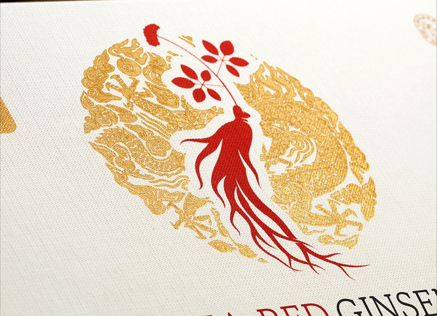
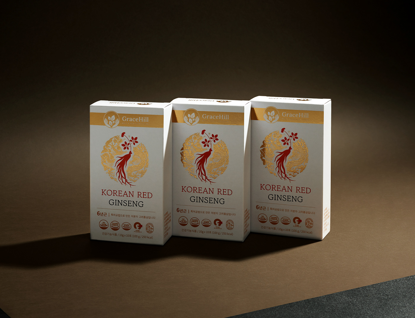
The primary aim of this project was to set it apart from Gracehill's existing product line, which is known for its diverse colours and positive vibes. For this project, we wanted to ensure that the oriental ingredient "ginseng" caught the eye and that the premium quality of the product was conveyed effectively. It was crucial to communicate that this product is a limited-edition "Special" release, offered periodically, while also maintaining the essence of Gracehill's brand image and adding a touch of sophistication.
Design Journey
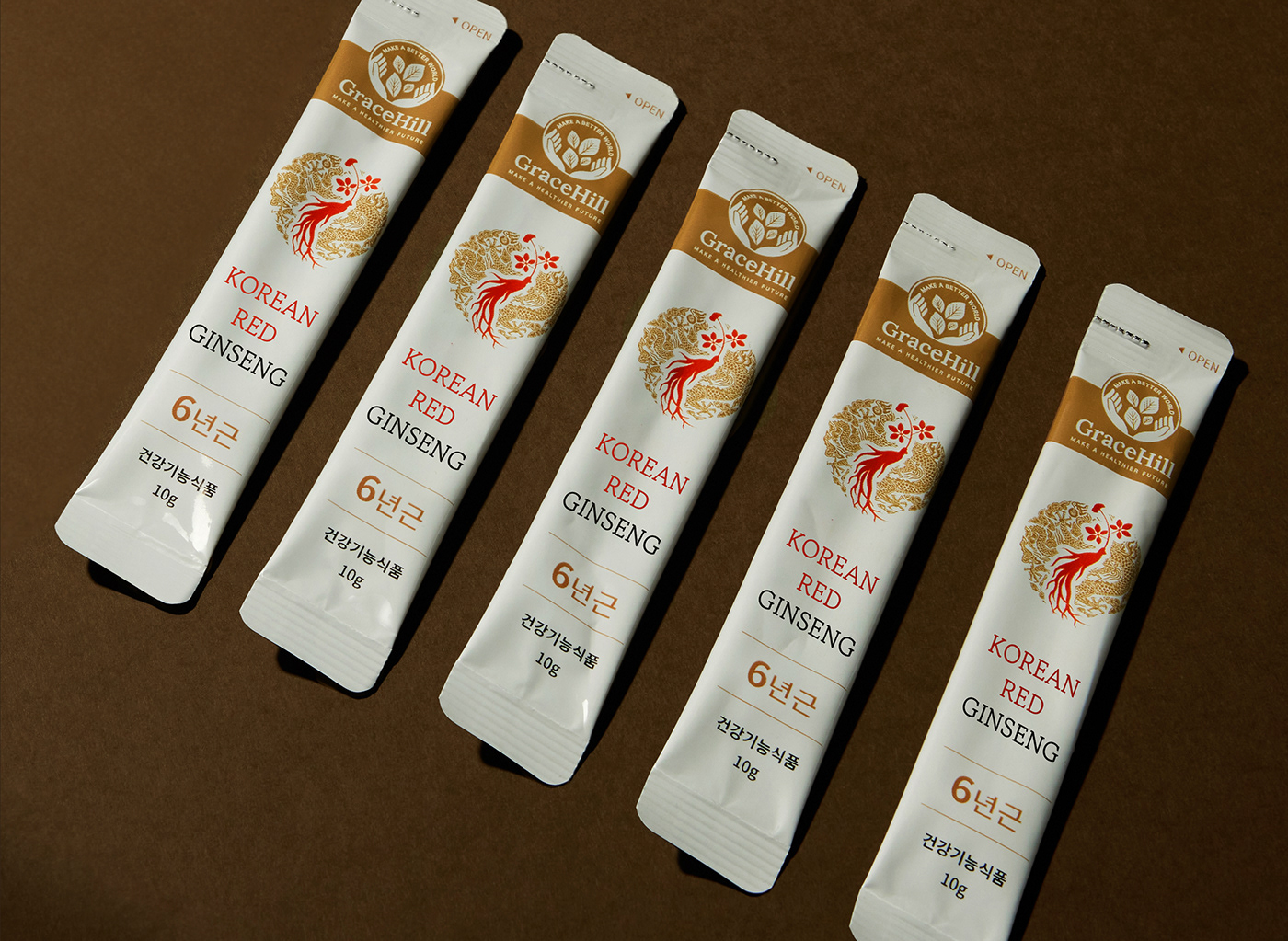
The packaging design process this time was particularly fascinating. To express the premium product, we had to use special paper and engage in extensive discussions with the manufacturer to achieve the desired gold foiling effect. When it came to the Stick Pouch Foil colour, we had to work closely to match a colour similar to boxes’ gold foil while keeping production costs in check. These discussions and efforts were integral to the success of this project.
Packaging design isn't just about the graphic aspects; it involves considerations for paper materials, post-processing, and even the final product. It made me realize once again that a designer's skill set encompasses not only the visual aspects but extends to the tangible elements of the design process.


Design Solution
Considering that this product is released for a limited time and is meant for gifting, we made the decision to go with a Hybrid Packaging Design, rather than sticking to Gracehill's established layout identity. Gracehill's typical packaging identity was reserved for the single box, while the set box put more emphasis on the themes of "ginseng" and "gift." To infuse a sense of oriental artistry and add an air of luxury, we incorporated illustrations and used gold foiling throughout.
For the set box's paper material, we opted for a special paper known as Angel Cloth. This choice was made to enhance the tactile experience customers have when they receive the product, maximizing their satisfaction.
We also took into account the challenge of incorporating numerous symbols on the front, which could potentially make the design look cluttered. To address this, we arranged them neatly in a row, staying within the layout's boundaries. This approach maintained an overall clean and uncluttered appearance while preserving the integrity of the design.